Multiple Cards
The MultipleCards component allows you to show your customers a list of their different cards, and allows them to manage the cards lifecycle.
Usage Examples
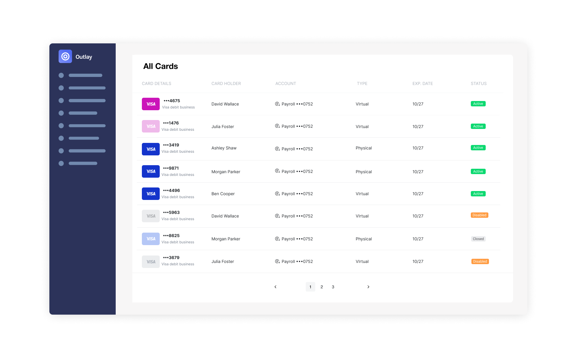
Example 01
Desktop View Large
Desktop full screen tabular view for maximized wide view with all the columns available. Available with pagination or infinite scroll.
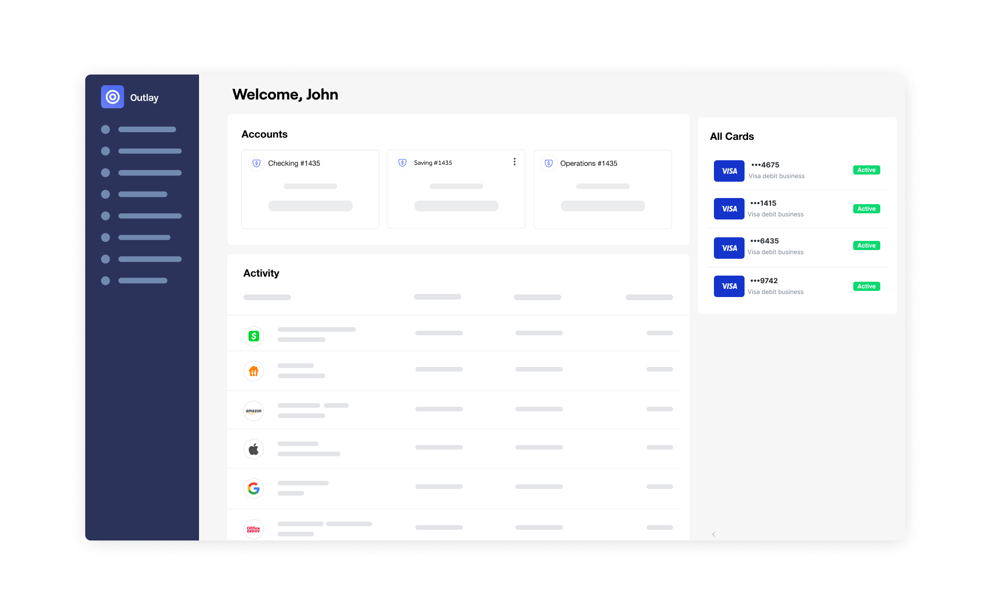
Example 02
Desktop View Small
Desktop minimized list view used as a navigational element or as panel on the side. Available with pagination or infinite scroll.
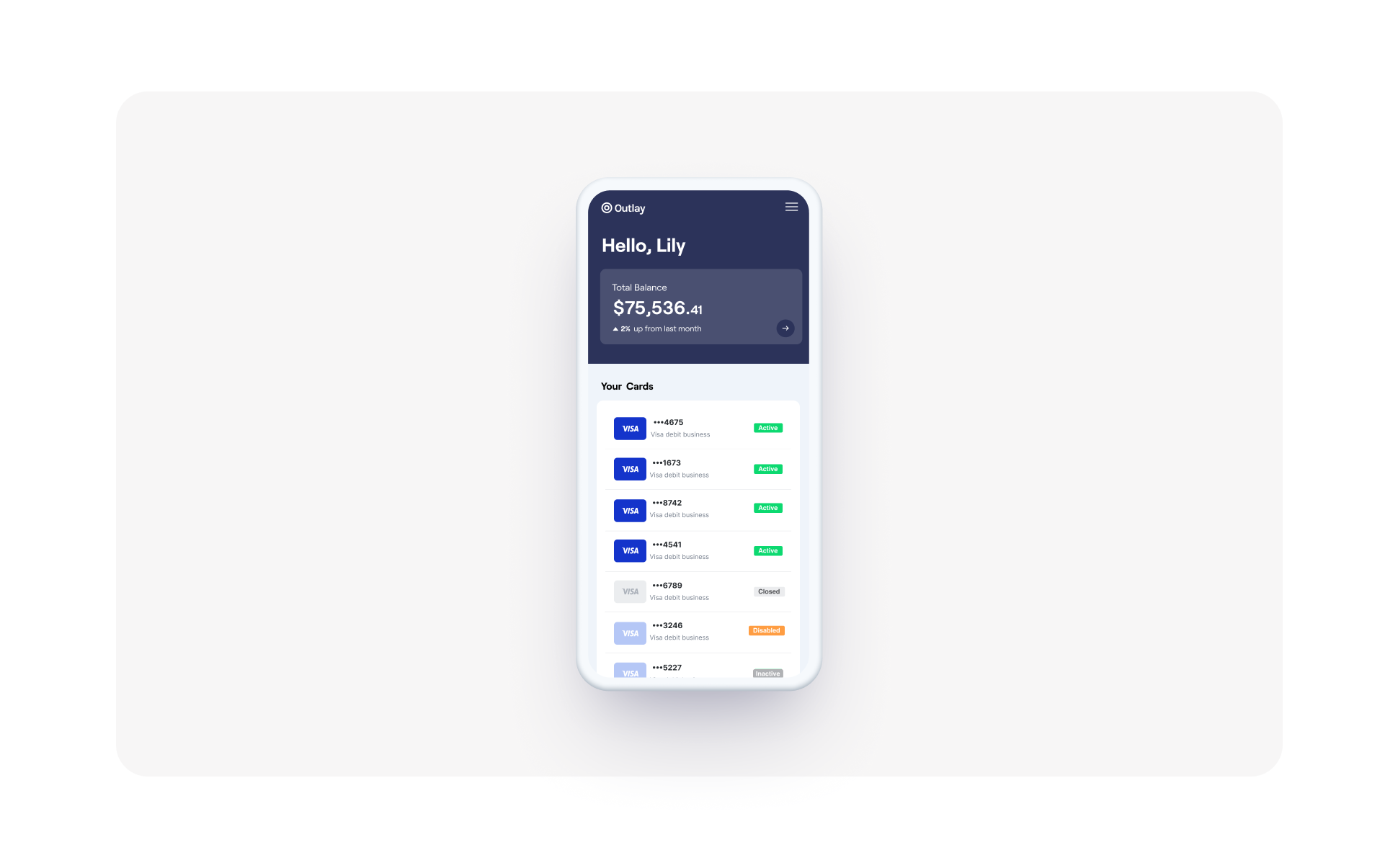
Example 03
Mobile View
Responsive mobile list view compatible with all mobile screen sizes. Available with pagination or infinite scroll.
Implementation
Web Components
Add the Multiple Cards element to your app where you'd like it to be presented.
<unit-elements-multiple-cards
  customer-token=""
  theme=""
  language=""
  hide-card-actions-button="false"
  disable-card-click="true"
  disable-account-click="true"
  columns="details,fullName,account,type,expirationDate,status"
  query-filter="filter[status][0]=Stolen&filter[status][1]=Lost&filter[status][2]=ClosedByCustomer"
  pagination-type="infiniteScroll"
  hide-back-to-top="false"
  is-row-item-clickable="true"
></unit-elements-multiple-cards>
Inputs:
| Name | Type | Required | Description |
|---|---|---|---|
| customer-token | string | Yes | A Unit Customer token. Required Scopes: customers cards cards-write |
| columns | string | No | Comma separated keys to display as table headers. The default is: "details,fullName,account,type,expirationDate,status" |
| pagination-type | string | No | Defines how more content is loaded. Possible values: "infiniteScroll" (default), "pagination" |
| cards-per-page | string | No | Number of cards to fetch on each page or scroll to bottom. Also acts as initial number of cards to fetch. The default is "8" for pagination and "15" for infinite scroll |
| hide-card-actions-button | string | No | When true, hide the card actions button that would appear on row hover. Possible values: "true" / "false" (default) |
| disable-card-click | string | No | When true, will not publish a unitMultipleCardsCardClicked event when a row is clicked. Possible values: "true" / "false" (default) |
| disable-account-click | string | No | When true, will not publish a unitMultipleCardsAccountClicked event when a row is clicked. Possible values: "true" / "false" (default) |
| language | string | No | A URL that specifies the language configuration. |
| theme | string | No | A URL that specifies the UI configuration. |
| query-filter | string | No | Query for filtering cards: Cards |
| hide-title | string | No | Hide the component title in case value is 'true'. |
| hide-back-to-top | string | No | Hide back to top button in case value is 'true'. |
| is-row-item-clickable | boolean | No | A boolean that specifies if the row item is clickable. |
Events:
| Event Name | Description | Detail |
|---|---|---|
| unitMultipleCardsCardClicked | Occurs when a card row is clicked | |
| unitMultipleCardsAccountClicked | Occurs when the account is clicked | |
| unitMultipleCardsSeeAllCardsClicked | Occurs when the "See all cards" button is clicked |
React Native SDK
UNMultipleCardsComponent props:
| Name | Type | Required | Description |
|---|---|---|---|
| theme | string | NO | A URL that specifies the UI configuration. |
| language | string | NO | A URL that specifies the language configuration. |
| paginationType | UNMultipleCardsComponentPaginationType | NO | Defines how more content is loaded. Possible values: UNMultipleCardsComponentPaginationType.infiniteScroll (default), UNMultipleCardsComponentPaginationType.pagination |
| cardsPerPage | number | NO | Number of cards to fetch on each page or scroll to bottom. Also acts as initial number of cards to fetch. The default is 8 for pagination and 15 for infinite scroll |
| hideTitle | boolean | NO | Hide title in case value is true |
| hideBackToTop | boolean | NO | Hide back to top button in case value is true |
| disableCardClick | boolean | NO | When true, will not publish a onCardClicked event when a row is clicked. Possible values: true / false (default) |
| showSeeAllCardsLink | Boolean | No | A boolean that specifies if see all cards link is displayed. |
| isRowItemClickable | Boolean | No | A boolean that specifies if the row item is clickable. |
| queryFilter | string | NO | Query for filtering Cards |
| onLoad | (response: UNComponentsOnLoadResponse<UNMultipleCardsOnLoadData>) => void | NO | Callback for a loaded component |
| onCardClicked | (card: UNCard) => void | NO | Occurs when a card row is clicked |
Example:
import React from 'react';
import {
  UNMultipleCardsComponent,
  UNCard,
  UNMultipleCardsComponentPaginationType,
  UNMultipleCardsOnLoadData
} from 'react-native-unit-components';


export default function YourComponent() {
  return (
    <UNMultipleCardsComponent
      paginationType={UNMultipleCardsComponentPaginationType.pagination}
      cardsPerPage={4}
      onCardClicked={(card: UNCard) => { console.log(card) }}
      onLoad={(response: UNComponentsOnLoadResponse<UNMultipleCardsOnLoadData>) => { console.log(response) }}
    />
  );
}
Android SDK
Component name: UNMultipleCardsComponent
getMultipleCardsComponent parameters:
| Name | Type | Required | Description |
|---|---|---|---|
| additionalSettings | UNMultipleCardsViewSettingsInterface | NO | Additional settings unique for this component |
| theme | String | NO | A URL that specifies the UI configuration. |
| language | String | NO | A URL that specifies the language configuration. |
| callbacks | UNMultipleCardsComponentCallbacks | NO | Component's Callbacks sealed class |
UNMultipleCardsComponentCallbacks
The callbacks parameter for UNMultipleCardsComponent is of the following type:
typealias UNMultipleCardsComponentCallbacks = (callback: UNMultipleCardsComponentCallback) -> Unit
The UNMultipleCardsComponentCallback is sealed class that has the following callbacks that you can receive from a MultipleCards component:
sealed class UNMultipleCardsComponentCallback {
    data class OnCardClicked(val card: UNCard): UNMultipleCardsComponentCallback()
    data class OnLoad(val onLoadResult: Result<List<UNCard>>): UNMultipleCardsComponentCallback()
}
To get the MultipleCards Component fragment, call the getMultipleCardsComponent method of UnitComponentsSdk.manager.ui.views.
Example:
import android.os.Bundle
import android.view.LayoutInflater
import android.view.View
import android.view.ViewGroup
import androidx.fragment.app.Fragment
import co.unit.un_components.api.UnitComponentsSdk
import co.unit.un_components.common.builders.UNMultipleCardsViewSettingsBuilder
import co.unit.un_components.common.enums.UNMultipleCardsComponentCallback
import co.unit.un_components.components.UNMultipleCardsComponent

class MultipleCardsFragment : Fragment() {
    private var unMultipleCardsComponent: UNMultipleCardsComponent? = null

    override fun onCreateView(
        inflater: LayoutInflater,
        container: ViewGroup?,
        savedInstanceState: Bundle?
    ): View? {
        val fragmentLayout = inflater.inflate(R.layout.FILE_NAME, container, false)

        // Define your callbacks
        val callbacks: (UNMultipleCardsComponentCallback) -> Unit = { callback ->
            when (callback) {
                is UNMultipleCardsComponentCallback.OnCardClicked -> handleCardClicked(callback.card)
                is UNMultipleCardsComponentCallback.OnLoad -> handleUnitOnLoad(callback.onLoadResult)
            }
        }

        // Check if this is a fresh creation or restoration after process death
        unMultipleCardsComponent = if (savedInstanceState == null) {
            // Fresh creation - create new component and add to fragment manager
            UnitComponentsSdk.manager.ui.views.getMultipleCardsComponent(
                theme = YOUR_THEME_URL,
                language = YOUR_LANGUAGE_URL
            ).also {
                childFragmentManager.beginTransaction()
                    .replace(R.id.CONTAINER_NAME, it as Fragment, FRAGMENT_TAG)
                    .commitNow()
            }
        } else {
            // Restoration after process death - find existing fragment by tag
            childFragmentManager.findFragmentByTag(FRAGMENT_TAG) as? UNMultipleCardsComponent
        }

        // Set callbacks after obtaining the component (required for both fresh and restored)
        unMultipleCardsComponent?.callbacks = callbacks

        return fragmentLayout
    }

    // ...
    // Event handlers
    // ...

    companion object {
        private const val FRAGMENT_TAG = "multiple_cards_component"
    }
}
The additionalSettings parameter for UNMultipleCardsComponent has this attribute:
UNMultipleCardsViewSettingsInterface
| Name | Type | Default Value | Description |
|---|---|---|---|
| paginationType | UNMultipleCardsComponentPaginationType | .InfiniteScroll | Defines how more content is loaded. Possible values: .InfiniteScroll (default), .Pagination |
| cardsPerPage | Int | null | Number of cards to fetch on each page or scroll to bottom. Also acts as initial number of cards to fetch. The default is 8 for pagination and 15 for infinite scroll |
| queryFilter | String | null | Query for filtering cards: Cards |
| disableCardClick | Boolean | false | Auto-focus the 'add new recipient' button once the component is mounted |
| hideTitle | Boolean | false | Hide the component title in case value is 'true'. |
| hideBackToTop | Boolean | false | Hide back to top button in case value is true. |
| showSeeAllCardsLink | Boolean | false | A boolean that specifies if see all cards link is displayed. |
| isRowItemClickable | Boolean | false | A boolean that specifies if the row item is clickable. |
You can use UNMultipleCardsViewSettingsBuilder() to create an instance of the interface and define your additional settings.
 val additionalSettings = UNMultipleCardsViewSettingsBuilder()
    .paginationType(...)
    .cardsPerPage(...)
    .queryFilter(...)
    .disableCardClick(...)
    .hideTitle(...)
    .hideBackToTop(...)
    .showSeeAllCardsLink(...)
    .isRowItemClickable(...)

unMultipleCardsComponent = UnitComponentsSdk.manager.ui.views.getMultipleCardsComponent(
    additionalSettings = additionalSettings,
    theme = YOUR_THEME_URL,
    language = YOUR_LANGUAGE_URL
)
IOS SDK
Component name: UNMultipleCardsComponent
Configuration parameters:
| Name | Type | Required | Description |
|---|---|---|---|
| additionalSettings | UNMultipleCardsViewSettingsProtocol | NO | Advanced optional settings. |
| callbacks | UNMultipleCardsComponentCallbacks | NO | Callbacks to interact with the Multiple Cards component. |
| theme | String | NO | A URL that specifies the UI configuration. |
| language | String | NO | A URL that specifies the language configuration. |
The callbacks parameter for UNMultipleCardsComponent is of the following type:
public typealias UNMultipleCardsComponentCallbacks = (_ callback: UNMultipleCardsComponentCallback) -> Void
The UNMultipleCardsComponentCallback is an enum that has the following callbacks that you can receive from a Multiple Cards component:
public enum UNMultipleCardsComponentCallback {
    case cardClicked(card: UNCard)
    case unitOnLoad(result: Result<[UNCard], UNComponentsError>)
}
To get the Multiple Cards Component view, call the getMultipleCardsComponent method of UnitComponentsSDK.manager.ui.views.
Example:
import UIKit
import UNComponents
import SnapKit

class MultipleCardsScreen: UIViewController {

    fileprivate lazy var multipleCardsComponent: UNMultipleCardsView = {
        let unViews = UnitComponentsSDK.manager.ui.views
        let multipleCardsComponent = unViews.getMultipleCardsComponent() { callback in
            switch callback {
            case let .cardClicked(card):
                print("Card clicked, ID: \(card.id)")
            case .unitOnLoad(let result):
                switch result {
                case .success(let cards):
                    print("Success Loading Multiple Cards")
                case .failure(let error):
                    print("Error Loading Multiple Cards")
                }
            }
        }
        return multipleCardsComponent
    }()

    override func viewDidLoad() {
        super.viewDidLoad()
        view.backgroundColor = .white

        // add the multiple cards component as a subview - using SnapKit for example
        view.addSubview(multipleCardsComponent)
        multipleCardsComponent.snp.makeConstraints { make in
            make.top.equalTo(view.safeAreaLayoutGuide.snp.top)
            make.bottom.equalTo(view.safeAreaLayoutGuide.snp.bottom)
            make.leading.trailing.equalToSuperview()
        }
    }
}
The additionalSettings parameter for UNMultipleCardsComponent is of the following type:
UNMultipleCardsViewSettingsProtocol:
| Name | Type | Default Value | Description |
|---|---|---|---|
| hideTitle | Bool | false | Hide the component title in case value is true. |
| hideBackToTop | Bool | false | Hide back to top button in case value is true. |
| queryFilter | String | Query for filtering cards: Cards. | |
| disableCardClick | Bool | false | When true, will not publish a unitMultipleCardsCardClicked event when a row is clicked |
| paginationType | UNMultipleCardsComponentPaginationType? | nil | Defines how more content is loaded. Possible values: .infiniteScroll, .pagination |
| cardsPerPage | Int | 8 for pagination and 15 for infinite scroll | Number of cards to fetch on each page or scroll to bottom. Also acts as initial number of cards to fetch |
| isRowItemClickable | Bool | false | A boolean that specifies if the row item is clickable. |
| showSeeAllCardsLink | Bool | false | A boolean that specifies if see all cards link is displayed. |
You can use UNMultipleCardsViewSettingsBuilder to create an instance of the protocol and define your additional settings.
Example:
let additionalSettings = UNMultipleCardsViewSettingsBuilder()
    .disableCardClick(true)
    .paginationType(.pagination)
    .cardsPerPage(4)

let unViews = UnitComponentsSDK.manager.ui.views
let multipleCardsComponent = unViews.getMultipleCardsComponent(additionalSettings: additionalSettings)