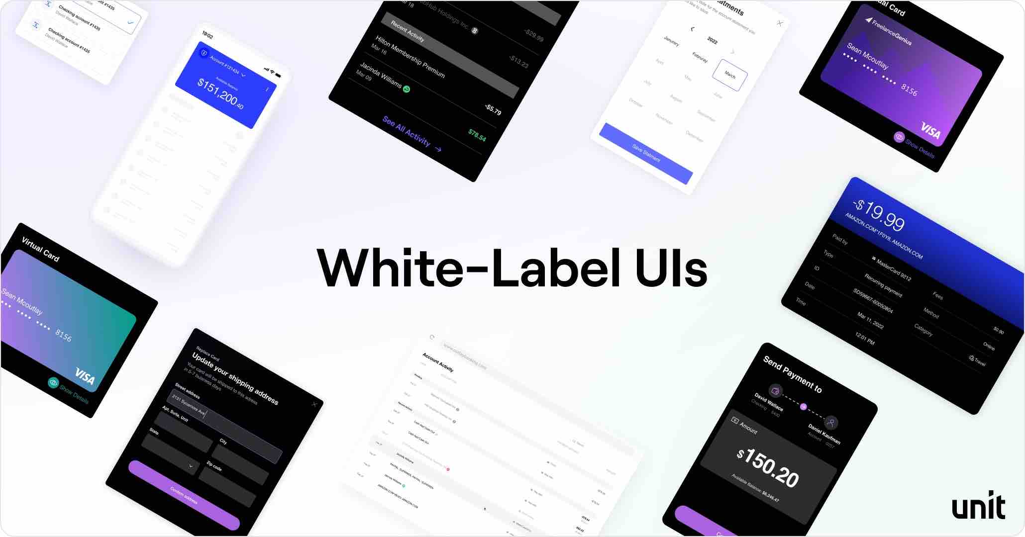
White-Label UIs
Building financial services and banking frontends requires time, expertise and resources. Unit offers a set of White-Label UI Components that simplify the build process, minimize the engineering investment, and significantly shorten time to market, while still providing you with complete flexibility and control.

New components will be frequently released, and some functionality may not yet be available.
Benefits
- Speed to market: Significantly lighter engineering investment compared to an API based approach, that requires substantial domain expertise and engineering investment.
- Best-in-class experience: The components are designed and built by banking technology experts, based on shared learnings from dozens of clients and other leading banking apps.
- Flexibility: You choose which (if any) components you want to use, and which to build in-house.
- Performance: Unit's UIs are highly performant and are tested using the best performance analysis tools (depending on the platforms).
- Customizability: Control the look and feel, as well as micro-copy, to align perfectly with your brand.
- Compliance, security and risk inside: Each Component has been designed to be fully compliant and meet industry best-practice standards for security and fraud prevention.
Platforms
Customization Options
Themes
The UI Components support multiple themes. You may define as many themes as you want, and within each theme, configure the look and feel to match your brand design. Each theme includes the ability to customize the following:
| Element | Customization |
|---|---|
| Typography | Font family, Title font weight |
| Colors | Background, Primary, Secondary, Neutral, Success, Warning, Errors |
| Buttons | Primary button color, Secondary button outline color, link button color |
| Text Inputs | Fill and outline colors, focus color, disabled color, corner radius |
| Menus | Icon colors |
| Drop Downs / Selection Lists | Fill and outline colors, focus state color, corner radius |
| Component containers / Cards | Corner radius |
Each of the customizable elements in a theme can be overridden on every specific component (e.g. "While all the buttons in my app are orange, I want the buttons on the card component to be blue"). In addition, there are specific elements on each component that are not a part of the global theme and can be specified on the component level. To learn more about themes, see the White Label Themes section.
If you have additional customization needs that aren't currently supported by our White-Label UIs, please reach out to Unit and let us know.
Language & Copy
Unit offers, by default, an English version of the components. However, you can customize the component texts to create multiple different versions of the same language, or to support new languages that we do not currently support.
Preview
To preview the different web components, and experiment with different white-label configurations, please access our component preview page
Component Availability
Typically, components will be available on web first, and a few weeks later they will be available in the mobile SDKs.
| Component | Web | React Native | iOS | Android | Usage |
|---|---|---|---|---|---|
| Application form | Y | Y | Y | Y | Web component / Call the API to get a URL and render it in an iframe / webview. |
| Statements | Y | Y | Y | Y | Call the API to get an HTML / PDF |
| Bank verification letter | Y | Y | Y | Y | Call the API to get an HTML / PDF |
| Card management | Y | Y | Y | Y | Web component / Mobile SDK |
| Activity | Y | Y | Y | Y | Web component / Mobile SDK |
| Account | Y | Y | Y | Y | Web component / Mobile SDK |
| Book payment | Y | Y | Y | Y | Web component / Mobile SDK |
| ACH Credit payment | Y | Y | Y | Y | Web component / Mobile SDK |
| ACH Debit payment | Y | Y | Y | Y | Web component / Mobile SDK |
| Check deposit | Y | Y | Y | Y | Web component / Mobile SDK |
| Multiple Cards | Y | Y | Y | Y | Web component / Mobile SDK |
| Wire Payment | Y | Y | Y | Y | Web component / Mobile SDK |
| Payee Management | Y | Y | N | N | Web component / Mobile SDK |
| Recurring Repayment | Y | N | N | N | Web component |
| ACH Repayment | Y | N | N | N | Web component |
| Create Card | Y | Y | N | Y | Web component / Mobile SDK |
| Next Repayment | Y | N | N | N | Web component |
| Program Details | Y | Y | Y | Y | Web component / Mobile SDK |
| Multi-Factor Authentication | Y | Y | N | Y | Web component / Mobile SDK |
